brand design case study

Annah Farm

Full Rebrand . WEBSITE DESIGN . PACKAGING DESIGN

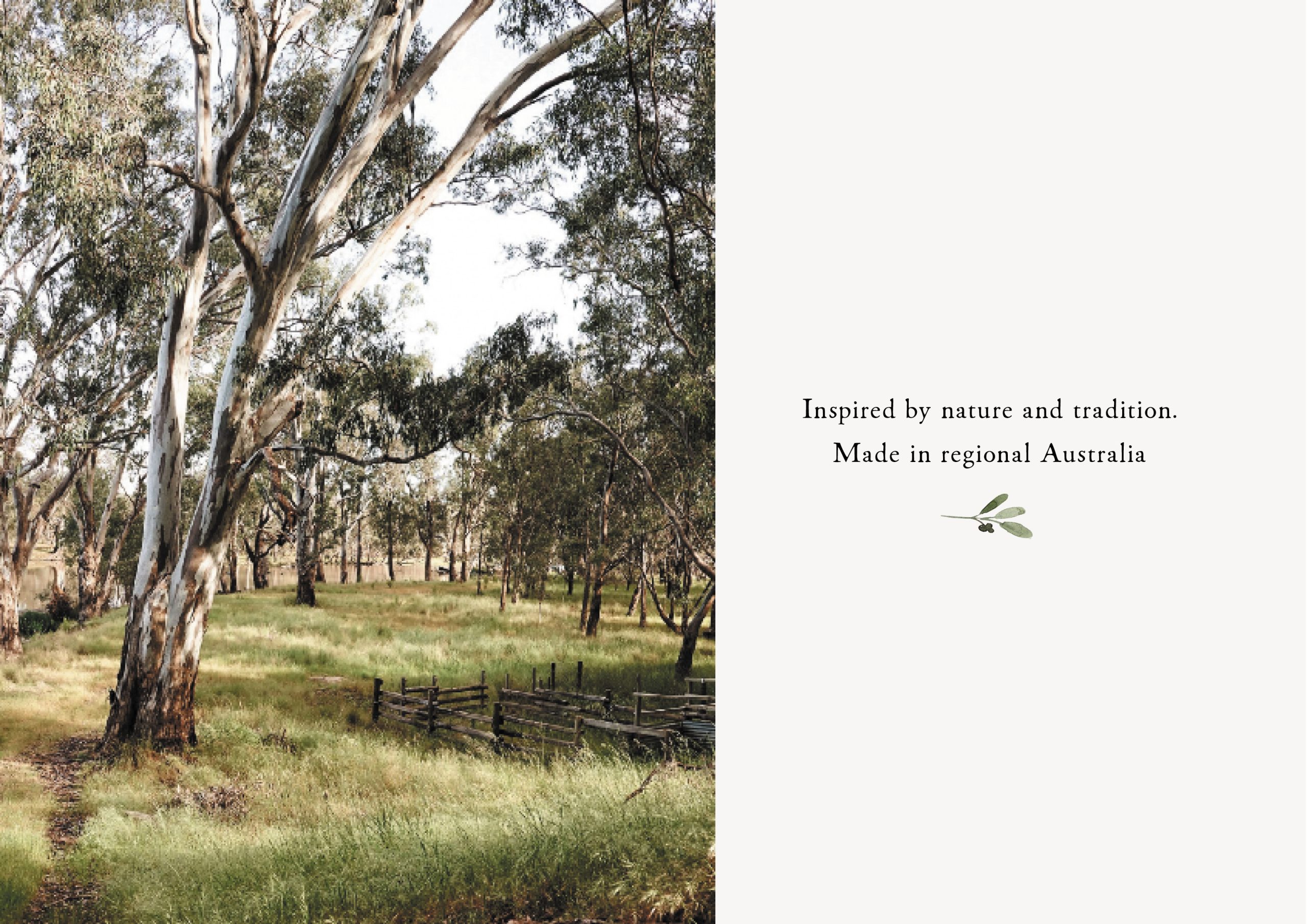
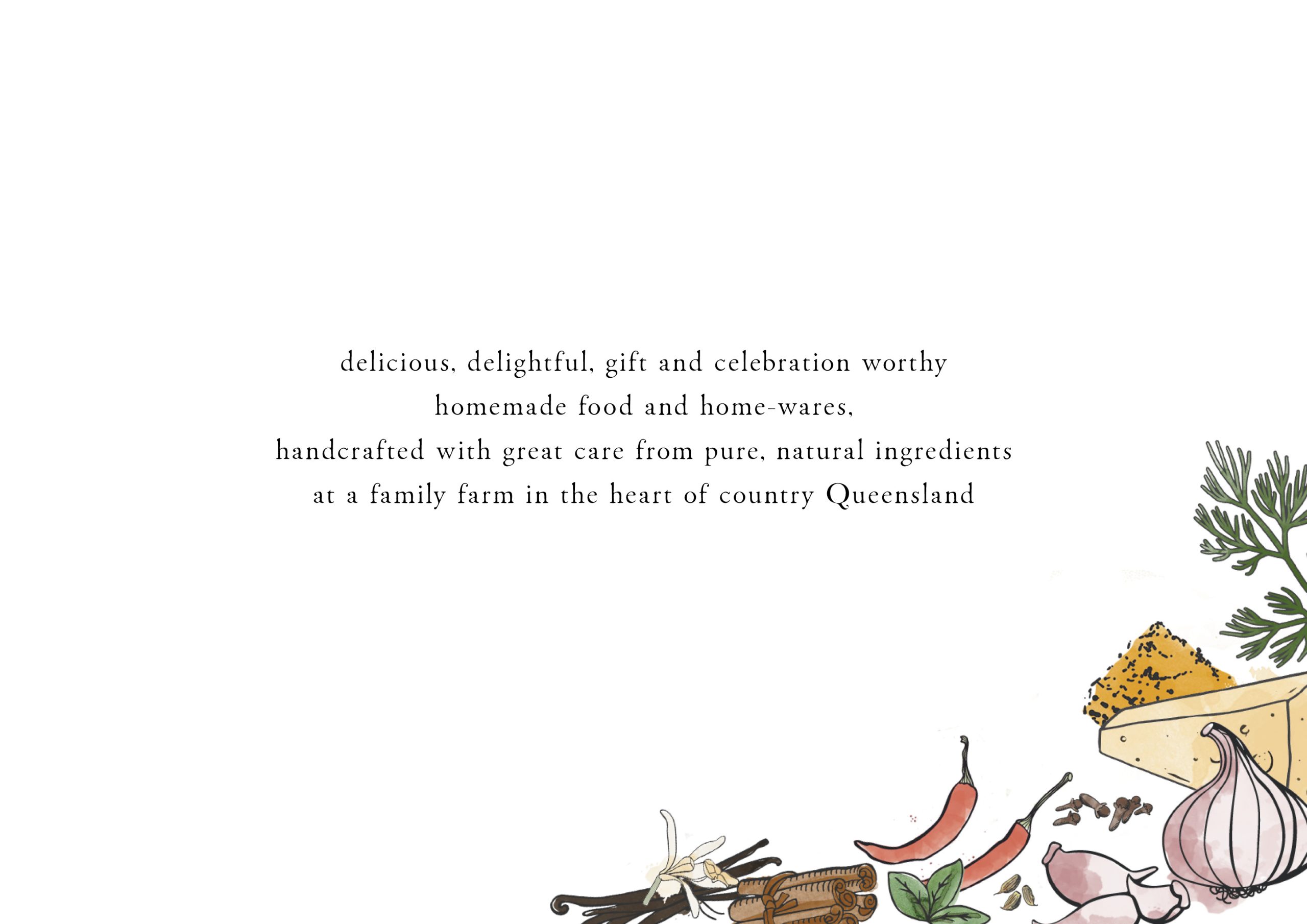
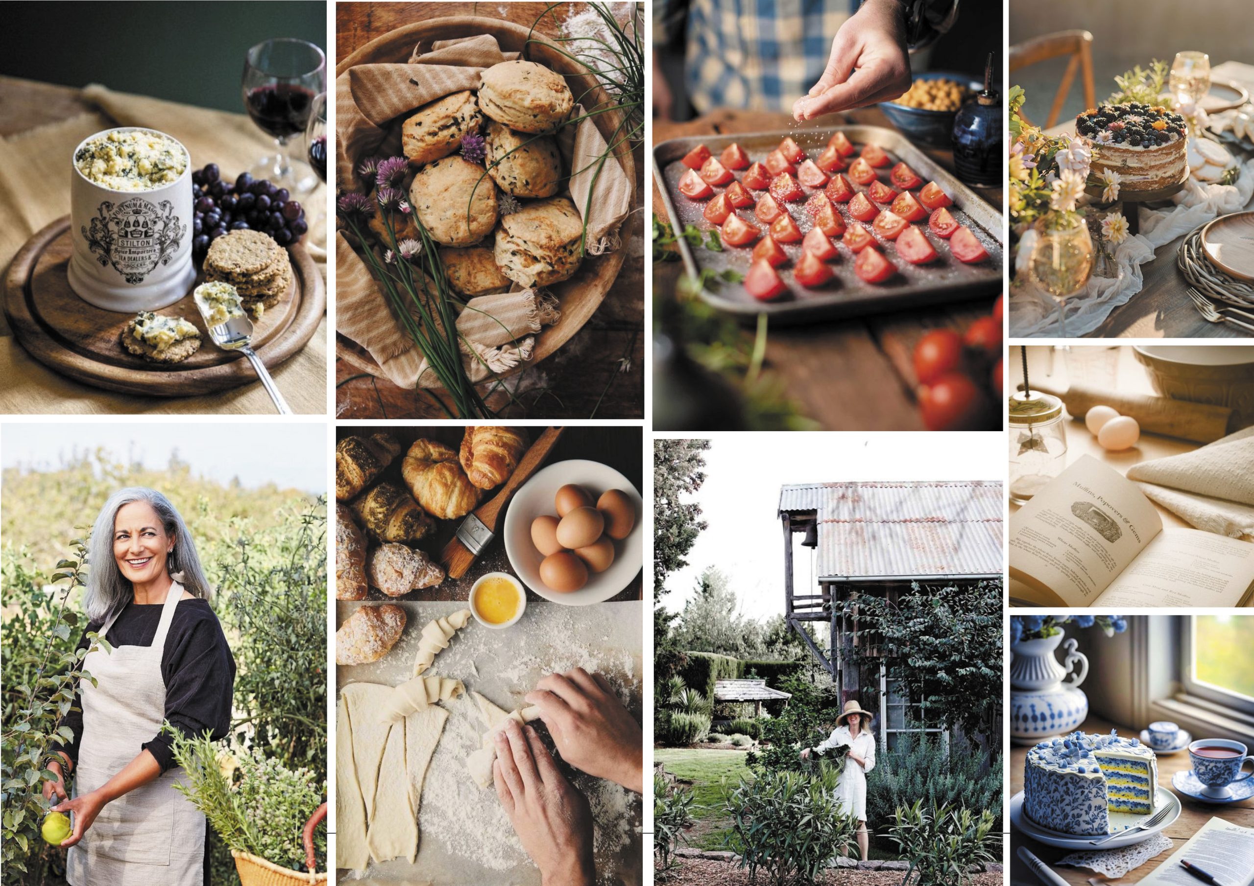
Nestled in the heart of regional Queensland, Annah Farm creates handcrafted, natural foods that celebrate the beauty of simple, homemade living. Each piece is made by hand and heart, inspired by nature, family, and the Australian countryside.

Brand Story

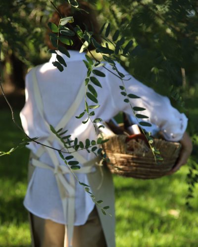
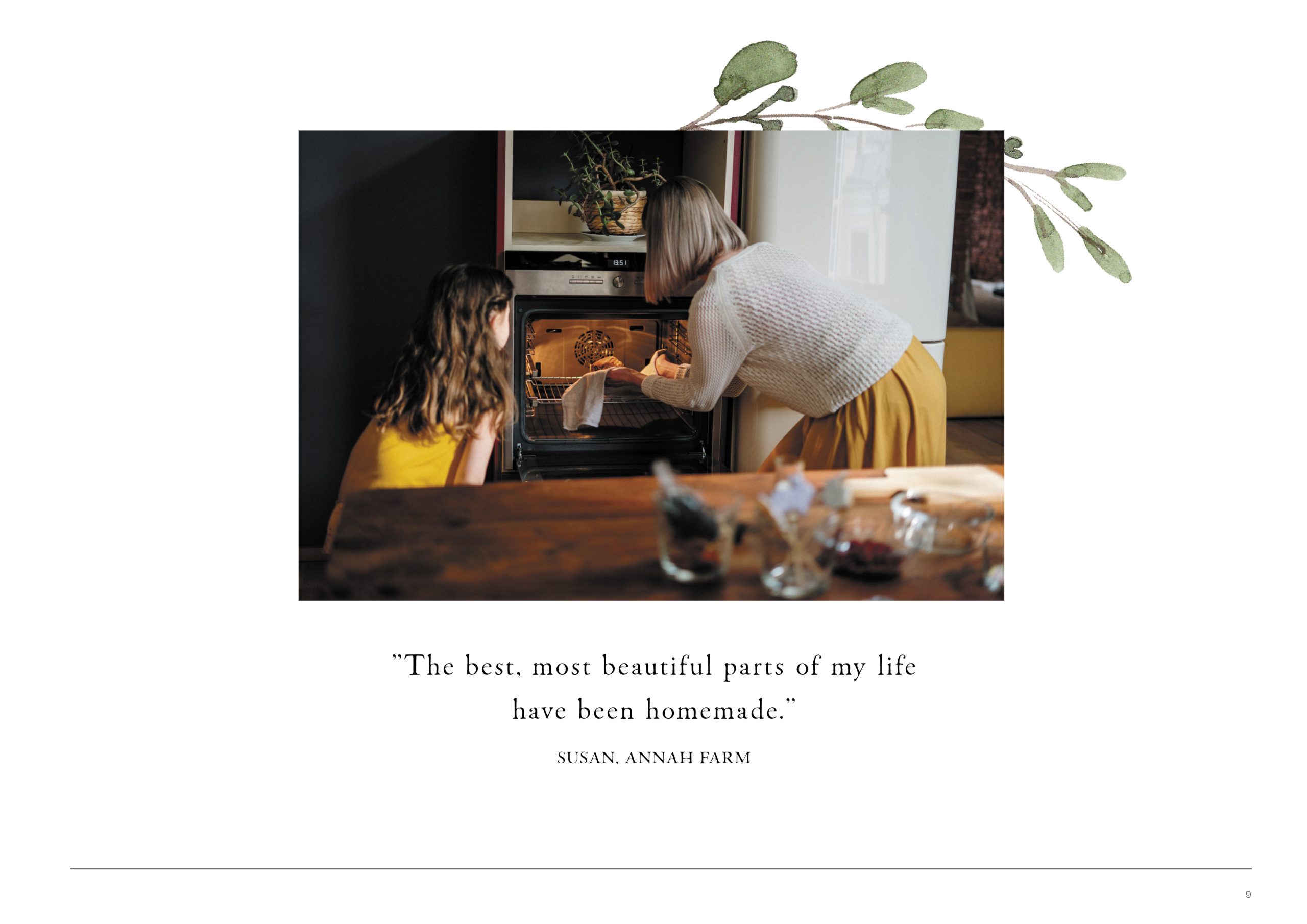
Annah Farm is the heartfelt creation of Susan – a nurturer, nature lover, and passionate foodie whose life has always revolved around homemade beauty. Growing up on the land surrounded by art, nature, and delicious food, Susan developed a deep appreciation for life’s simple pleasures. Those early experiences of sharing family meals, creating with her hands, and connecting to the land became the foundation for Annah Farm.

Driven by the belief that handmade food can elevate the everyday, Susan began crafting her own range of natural, handcrafted products from her farmhouse kitchen in Clifton, Queensland. Her vision was clear – to bring joy, connection, and authenticity back into the home through food and encourage others to savour life – to pause, create, and find delight in the ordinary.

IMG_4371

The Approach

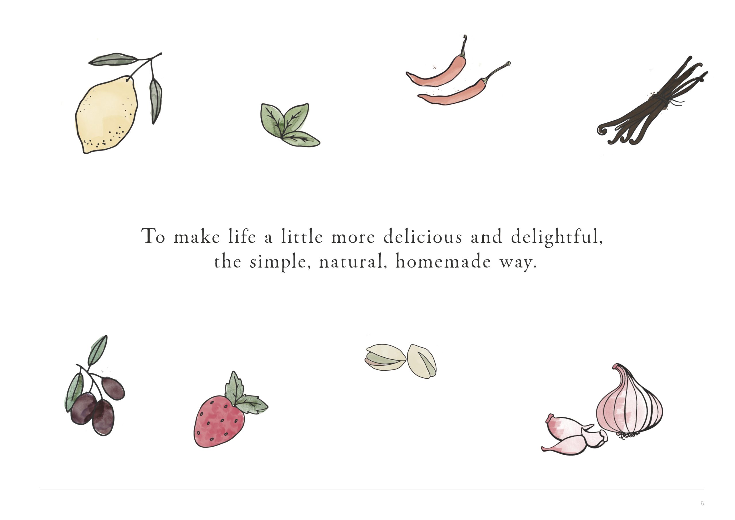
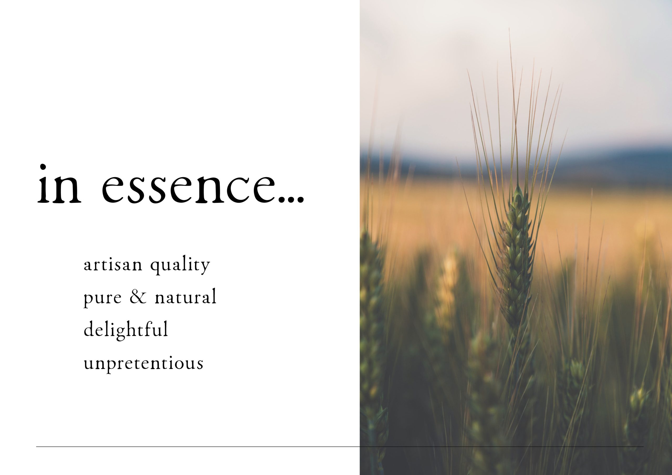
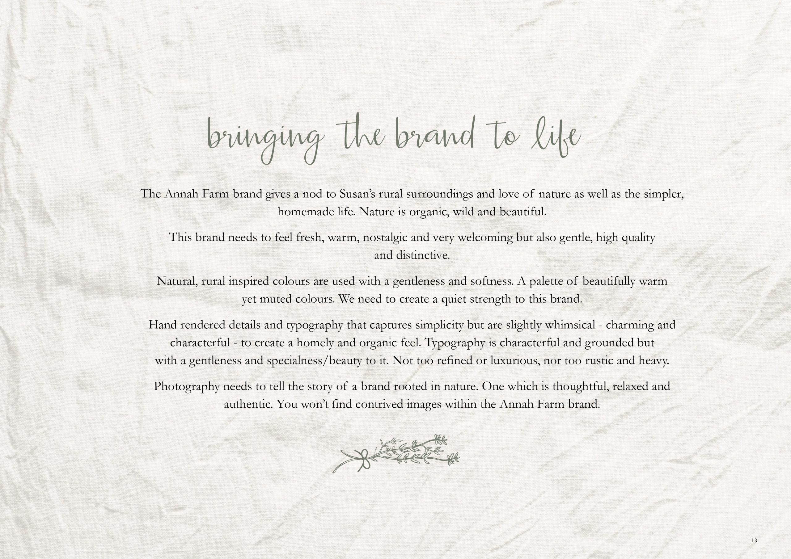
Warm, authentic, and unpretentious, Annah Farm embodies understated country charm – balancing artisan quality with a natural, heartfelt simplicity. The brand feels like a deep breath of fresh country air: nurturing, genuine, and crafted with care.

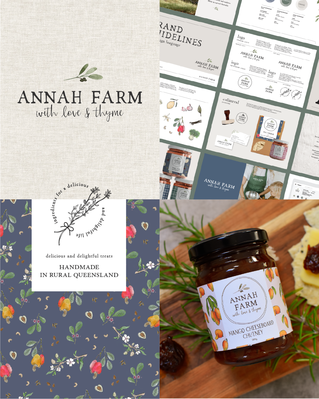
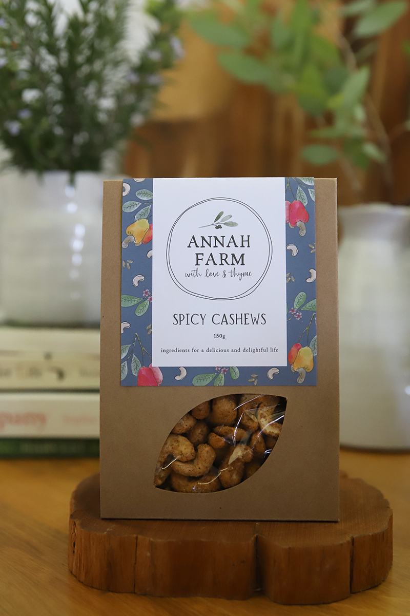
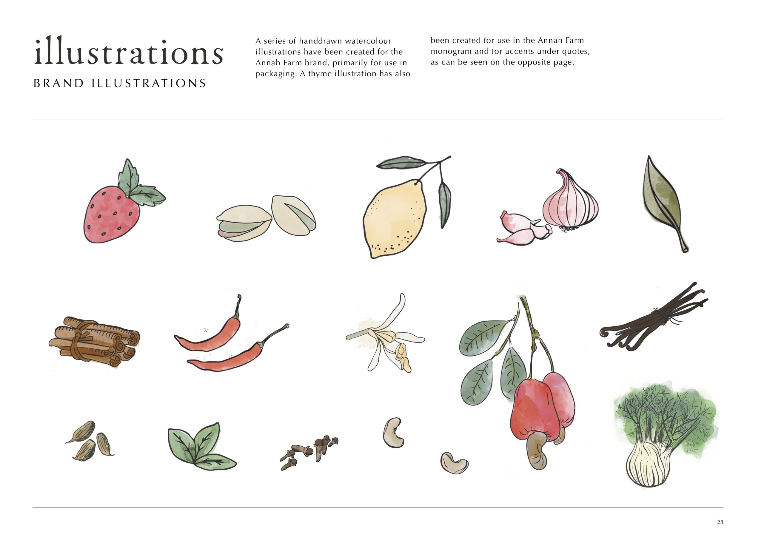
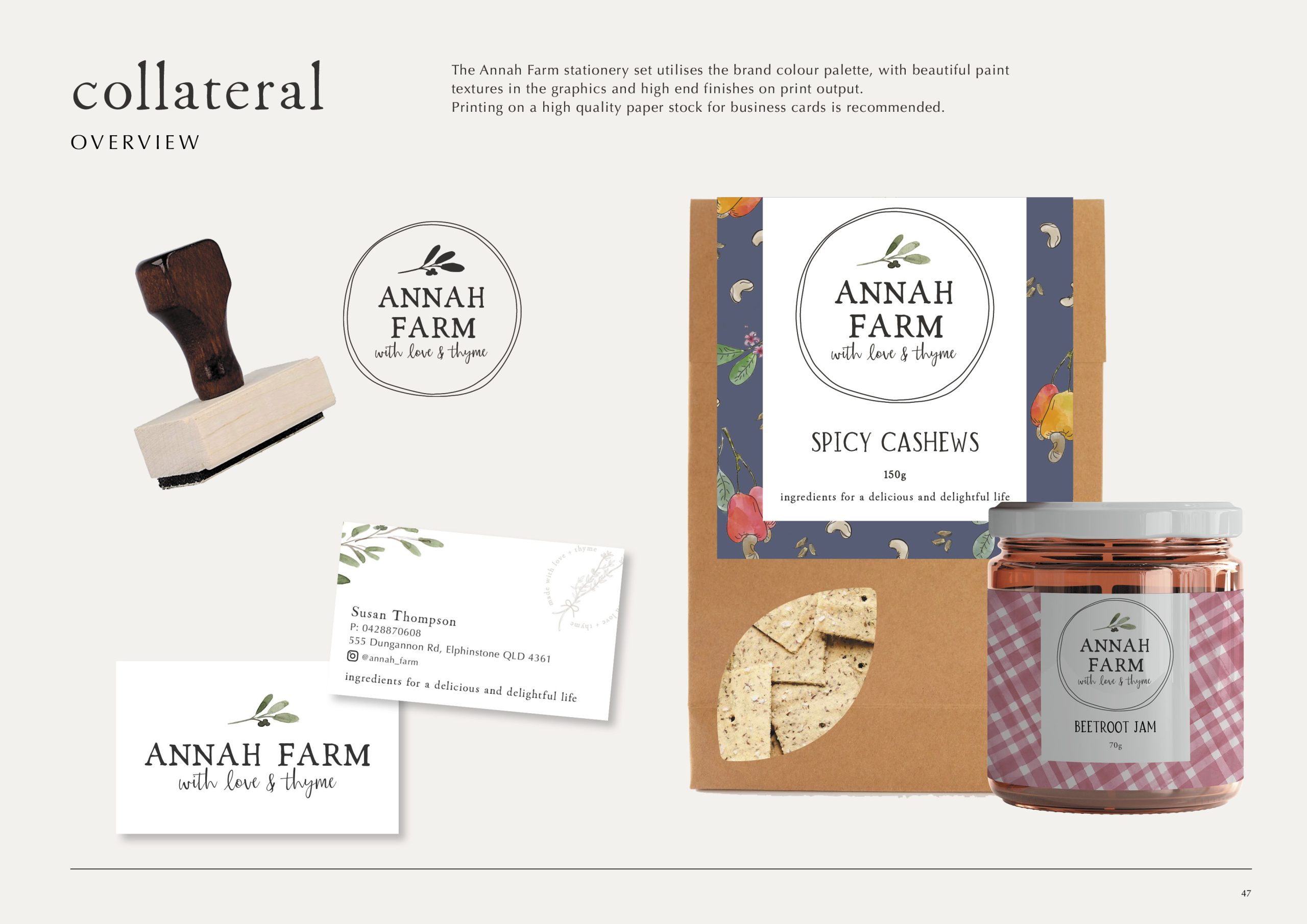
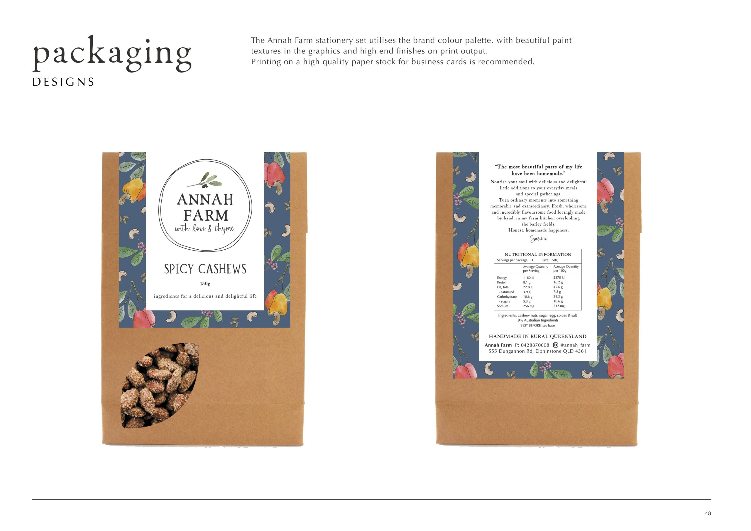
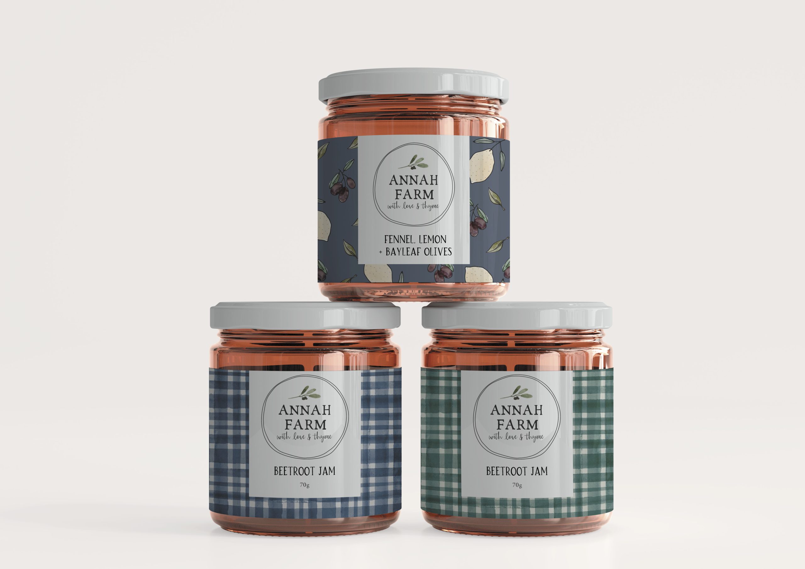
Packaging was a huge focus when creating this brand, and each packaging label has custom hand-drawn illustrations.

(I bet you didn’t know that this is what cashews look like on the tree!)

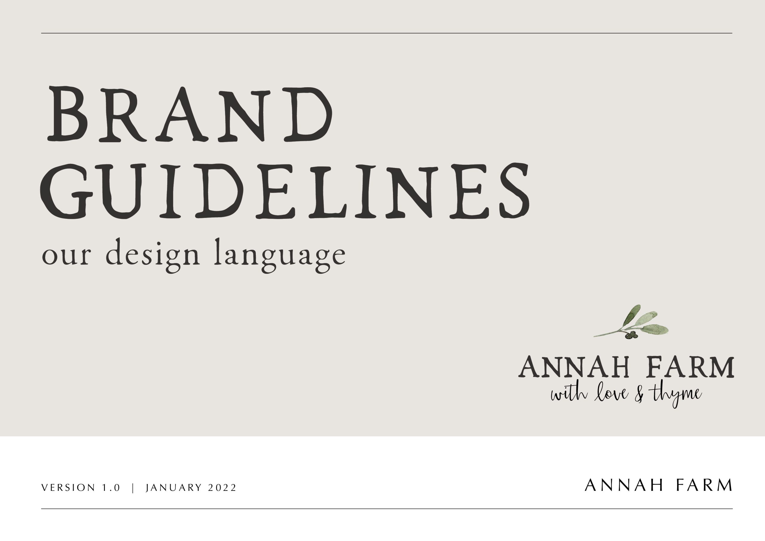
Anatomy of a Logo

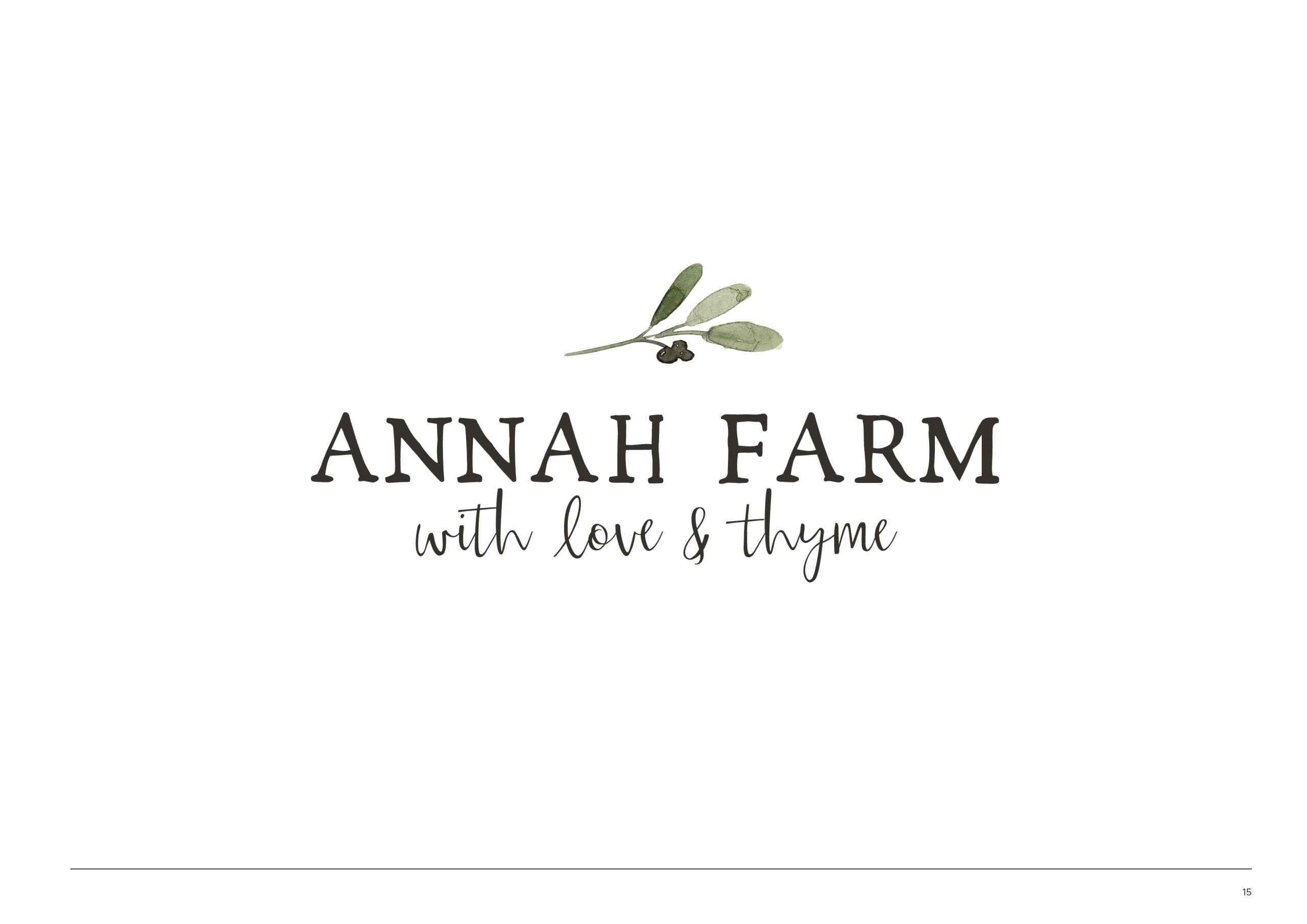
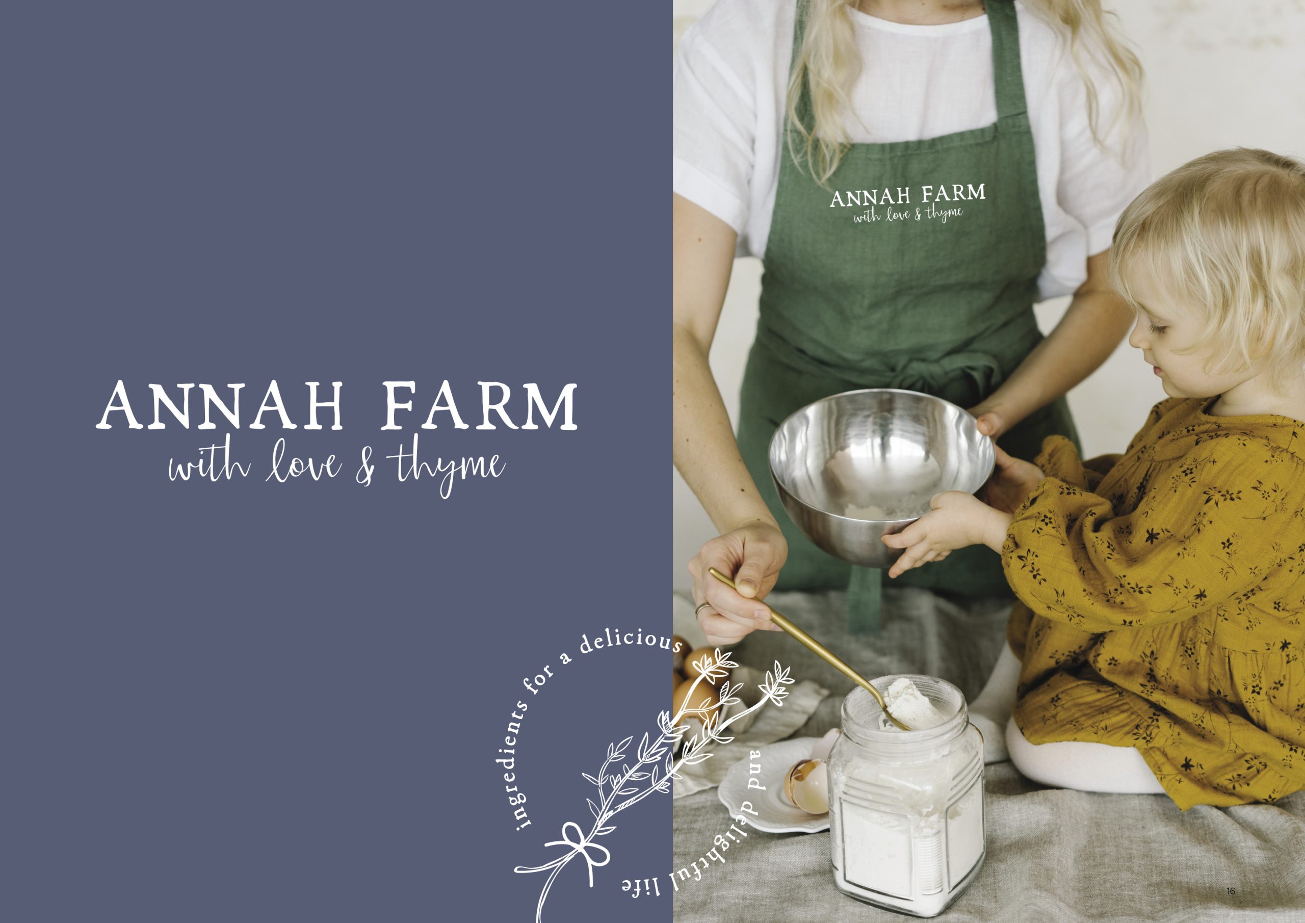
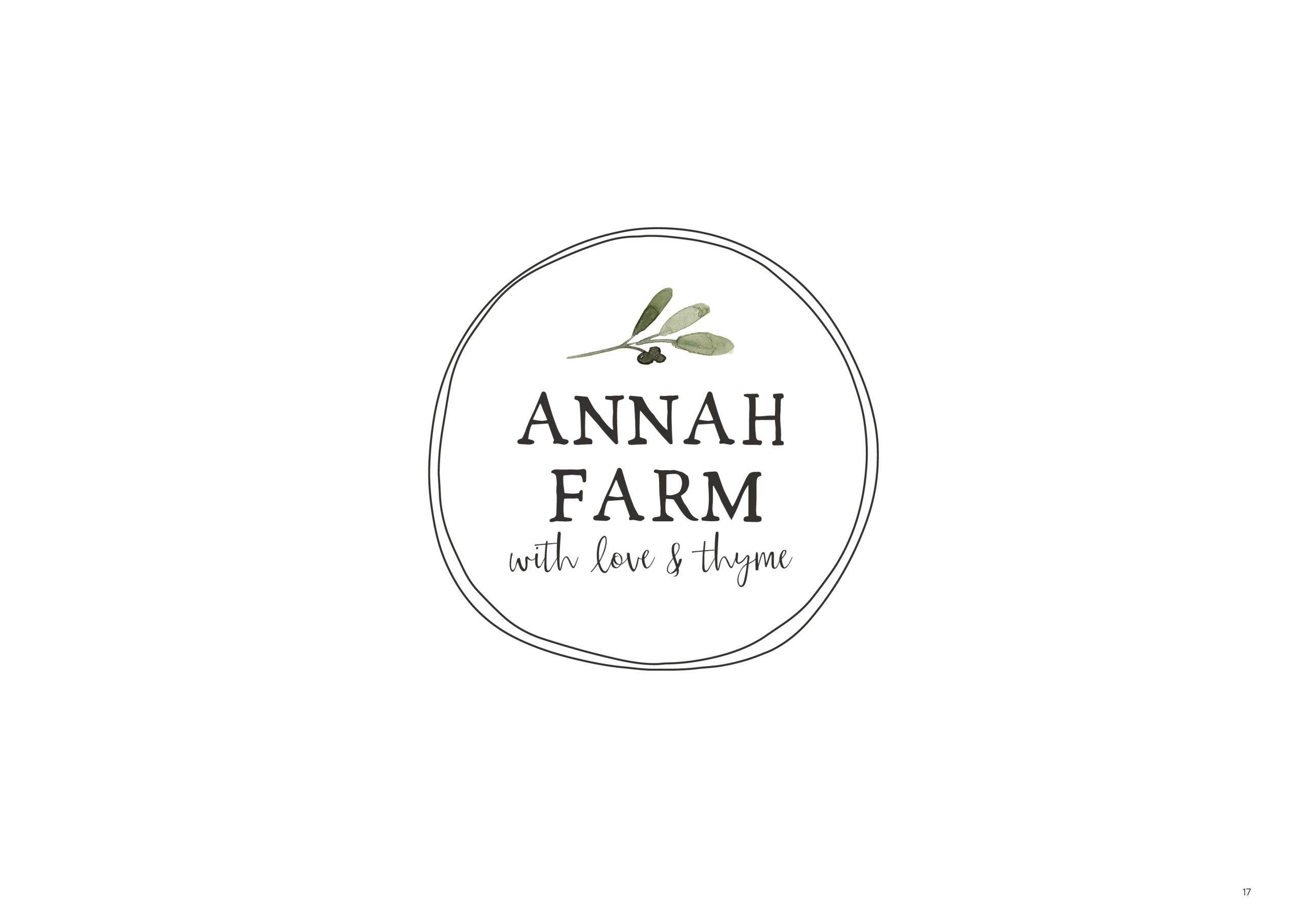
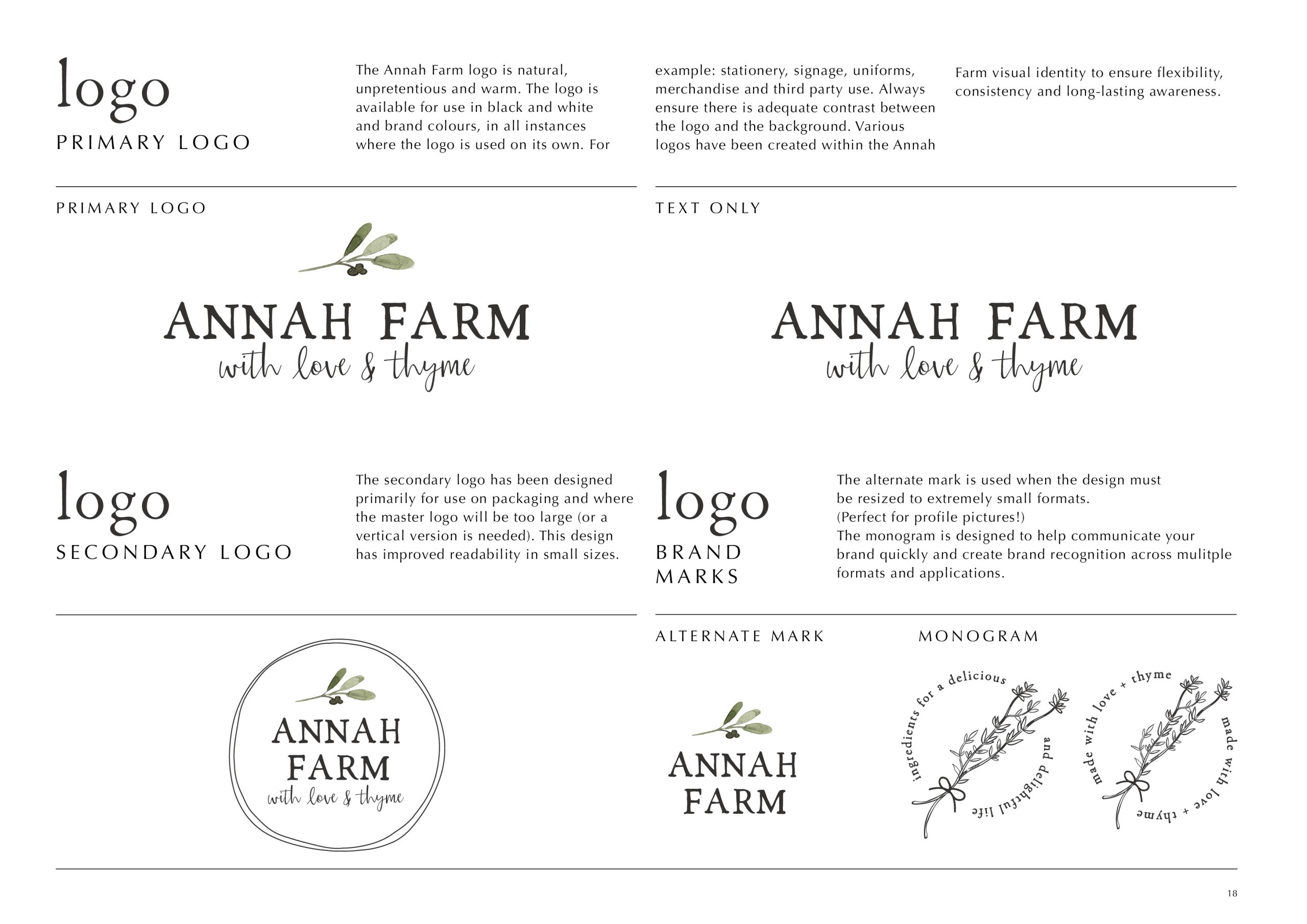
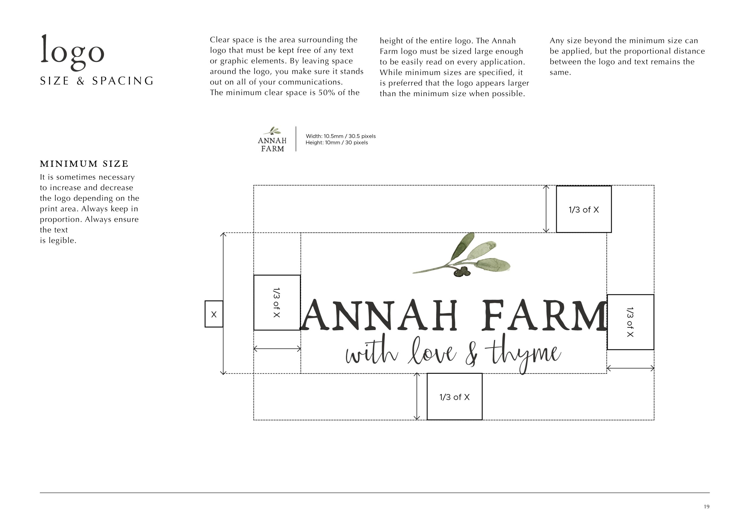
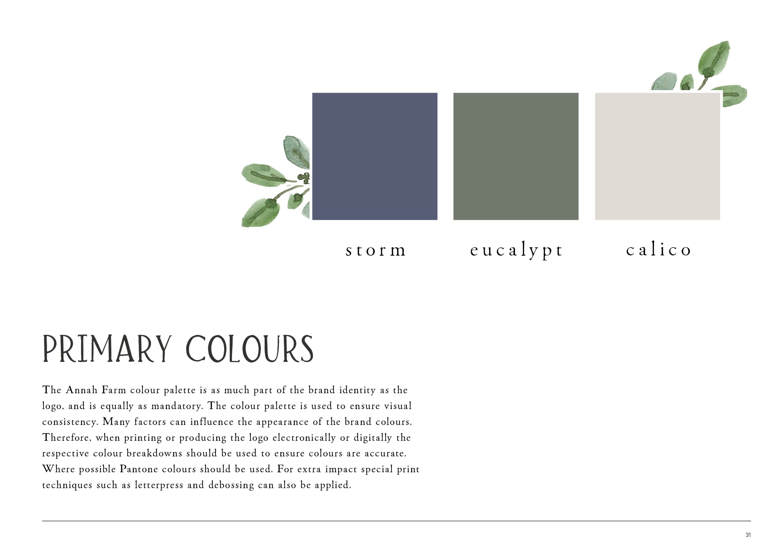
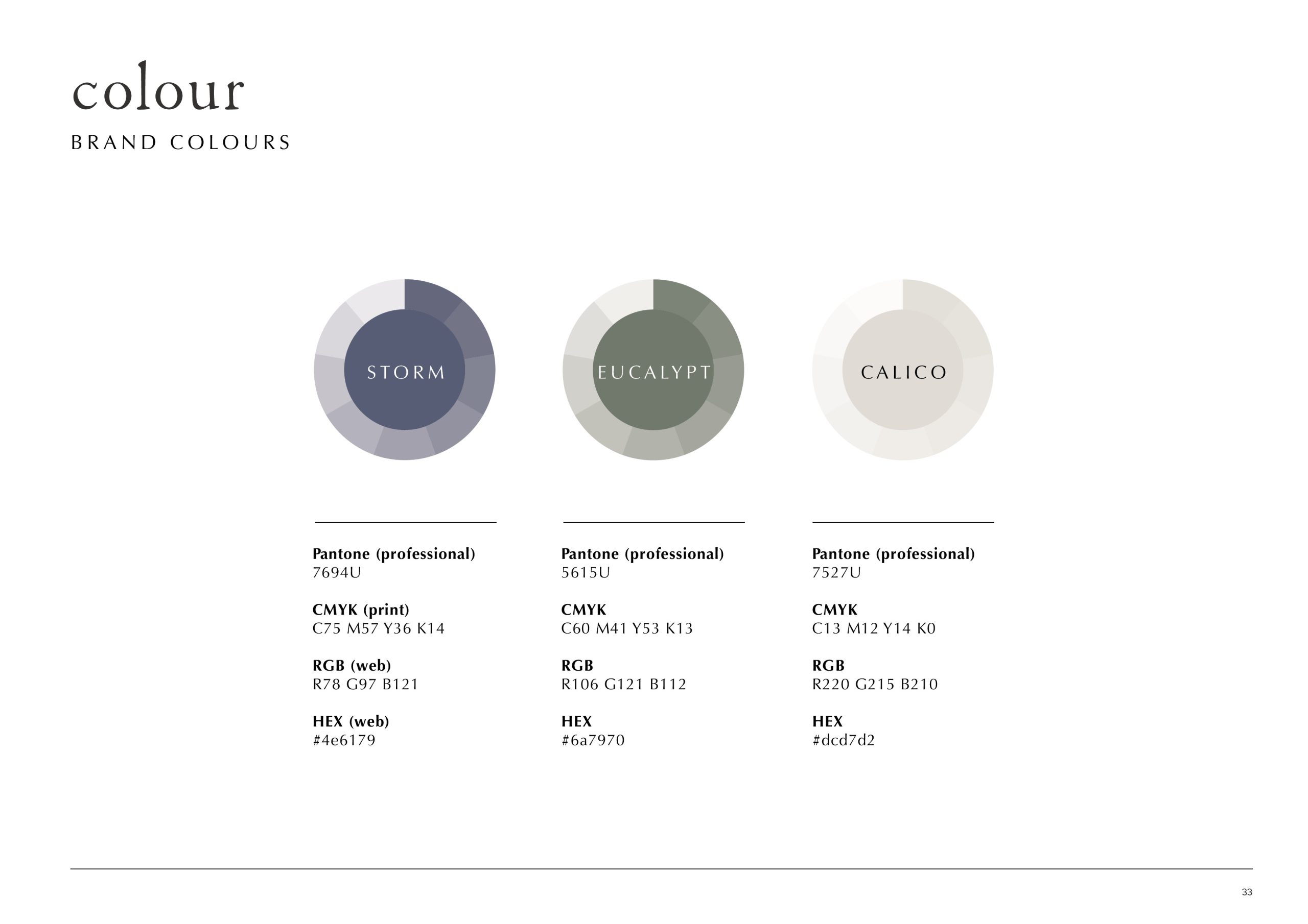
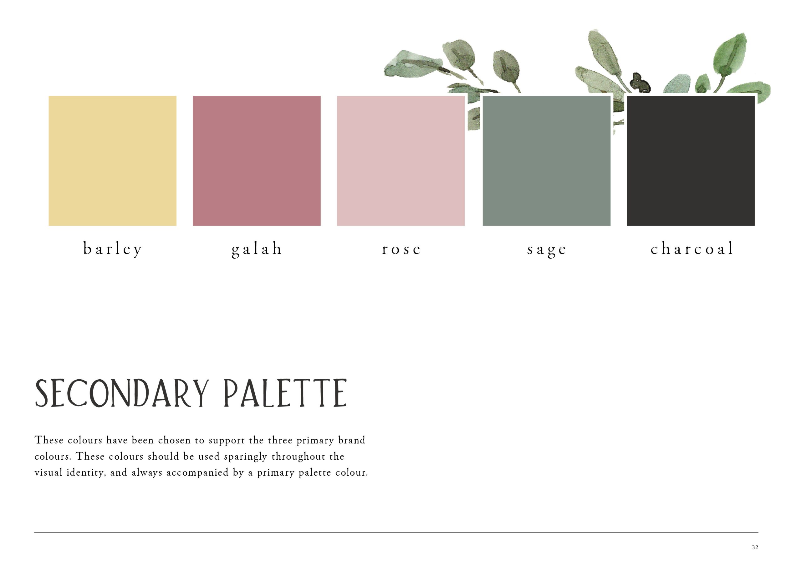
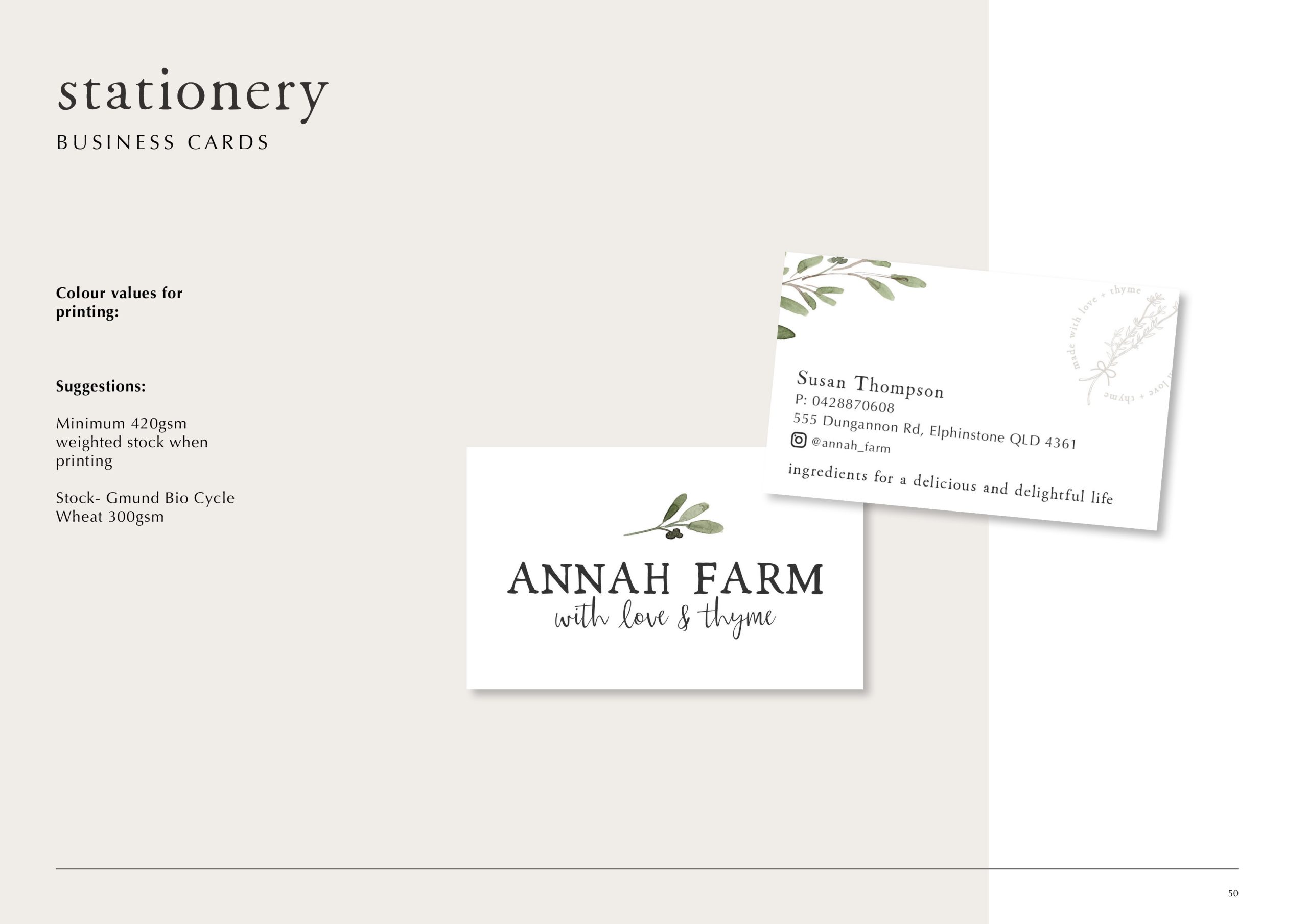
The Annah Farm logo captures the brand’s handmade warmth and connection to nature. The hand-rendered watercolour details and delicate typography evoke a sense of authenticity and craftsmanship, while maintaining a refined simplicity that mirrors Susan’s aesthetic. The gentle, natural palette — tones of eucalyptus, calico, and barley — reinforces the brand’s rural roots.

Together, these elements create a mark that feels both timeless and heartfelt — a true reflection of the brand’s essence: artisan quality, pure & natural, delightful, and unpretentious


Ahh-mazing! A shout out to Renae from Bird & Branch. She is the absolute powerhouse behind our rebrand and our ongoing marketing items. Conversations with Renae are easy, she sees our vision every single time and she executes with perfection every time! There is nothing too hard, but mostly she works alongside our business like it is her own, and we are so grateful for that! Thank you for loving our brand like we do and always providing us with amazing designs that hit the brief perfectly every single time!

Chloe watson and kirsty doherty
Recognition Plus

Ready to bring your brand to life?