Case Study – Nic Tewierik

brand design case study

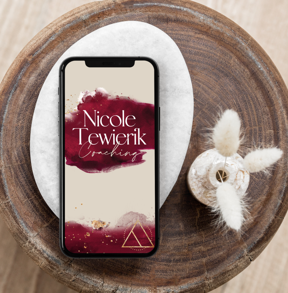
Nicole Tewierik Coaching

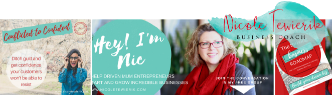
Previous Brand

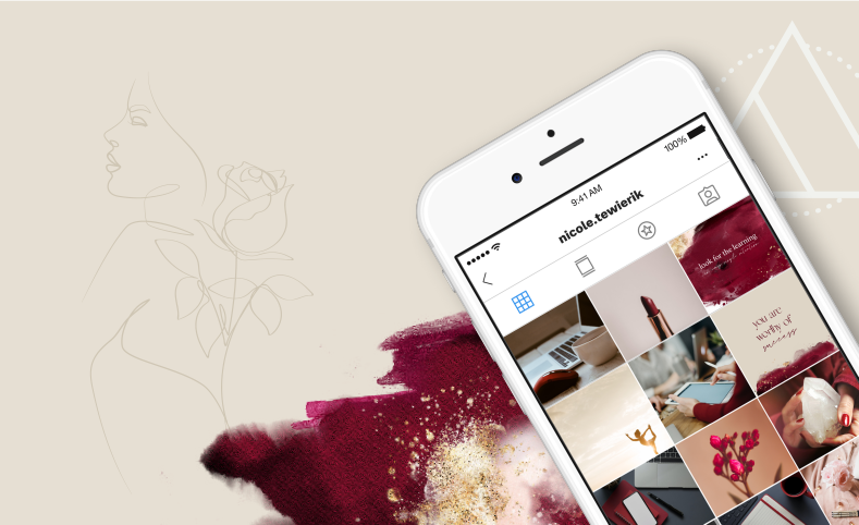
Full Rebrand . Social Media Templates . Proposal Templates

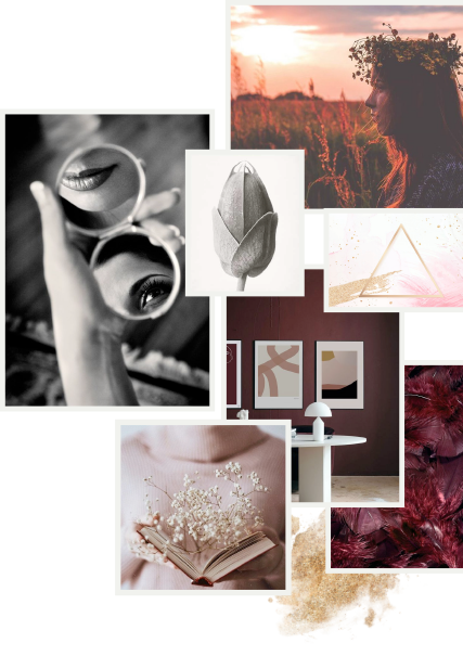
Nicole reached out at a time when her business offering was evolving, and she wanted her brand to evolve with her… to be authentic and less similar to other coaching brands. Her brief was earthy, connected, feminine and deep- a brand that will support the different offers she planned to put out in the future.

Nicole’s business is a balance between soul and energetic alignment, fused with business strategy. She explores the potential of stepping into your feminine power and gaining the confidence to succeed in business to create a life of fulfillment, freedom and control.

Feminine Empowering Alignment

For the Nicole Tewierik brand, I developed a brand mark that includes a triangle.

Triangles are a symbol of balance: in various spiritual and mystical traditions, the triangle can represent balance and harmony. It’s often seen as a symbol of the trinity, which can have different meanings, such as mind, body, and spirit, or past, present, and future.

This particular triangle with the interior line is a symbol of transformation, and aligns perfectly with the brand values.

SUB BRANDS

Renae did the new branding for my business and I absolutely love it!! She perfectly captured the depth and message of the brand through our visual identity. I highly recommend Renae for all your business graphic design needs!
Nicole Tewierik

Ready to bring your brand to life?